Role
End-to-end ui/ux designer
End-to-end ui/ux designer
TOOLS
Figma, InVision, Milanote, Pen & Paper
Figma, InVision, Milanote, Pen & Paper
PLATFORM
iOS/Mobile
iOS/Mobile
DURATION
10 Weeks
10 Weeks
Problem space
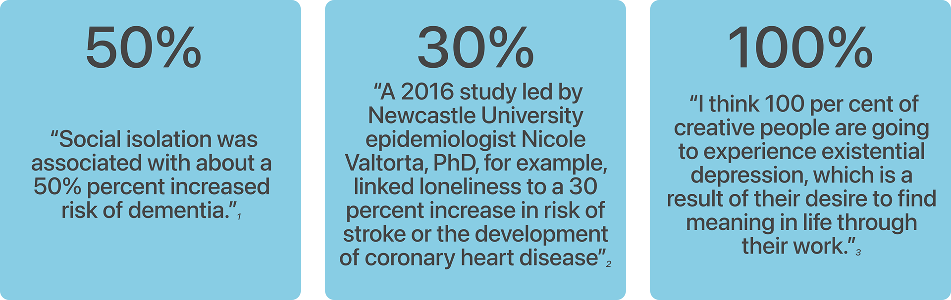
How do we manage the noise we're currently experiencing in the social networking space? Services are good at one thing, and very poor at others. This results in a scattergun approach by creatives to connect, as well as share their work by signing up for whatever social media service is trending at the moment. This noise can sometimes lead to exhaustion, discouragement and even loneliness.
This research aims to find a way to help creative people find a dedicated service that caters to their needs, and helps them grow as artists and entrepreneurs.
How might we help creatives find others with similar interests in order to collaborate on projects, and reduce the negative impact of loneliness?
SECONDARY RESEARCH
ASSUMPTIONS
Creatives often seek collaboration on projects especially when it requires a team effort e.g. shooting a video.Everyone experiences loneliness, whether creative or not. However creative people can channel that into productivity.Creative people want to connect with other creatives.
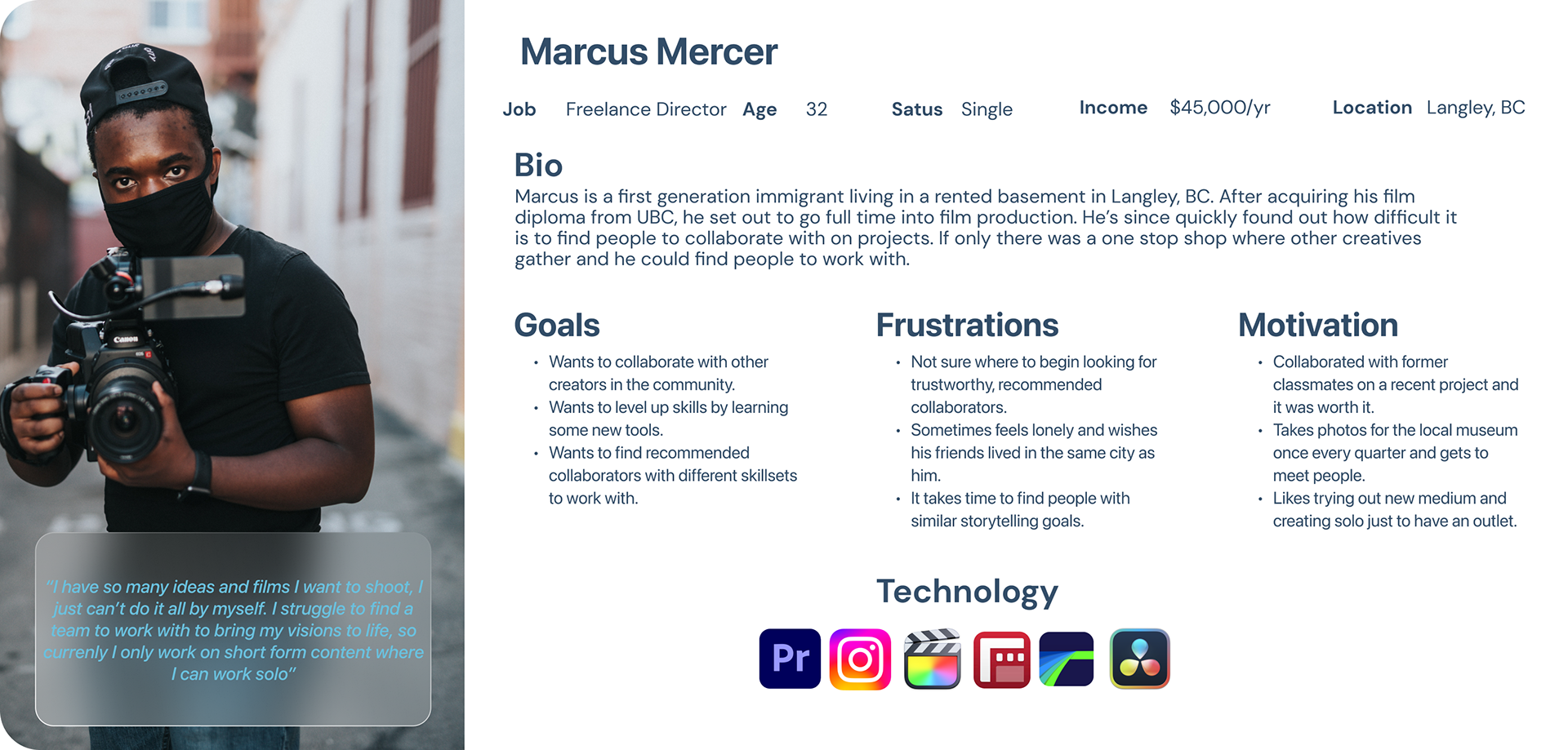
PERSONA
USER STORY
As a creative, I want to be able to search for other creatives around me, so that I can collaborate with them on projects.
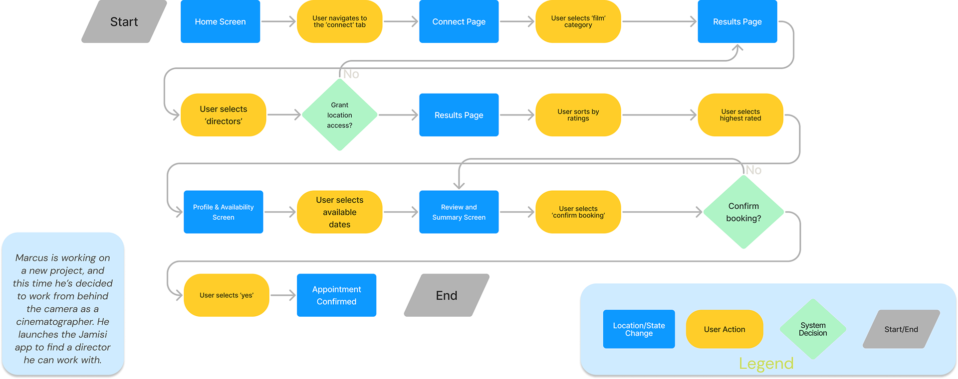
TASK FLOW
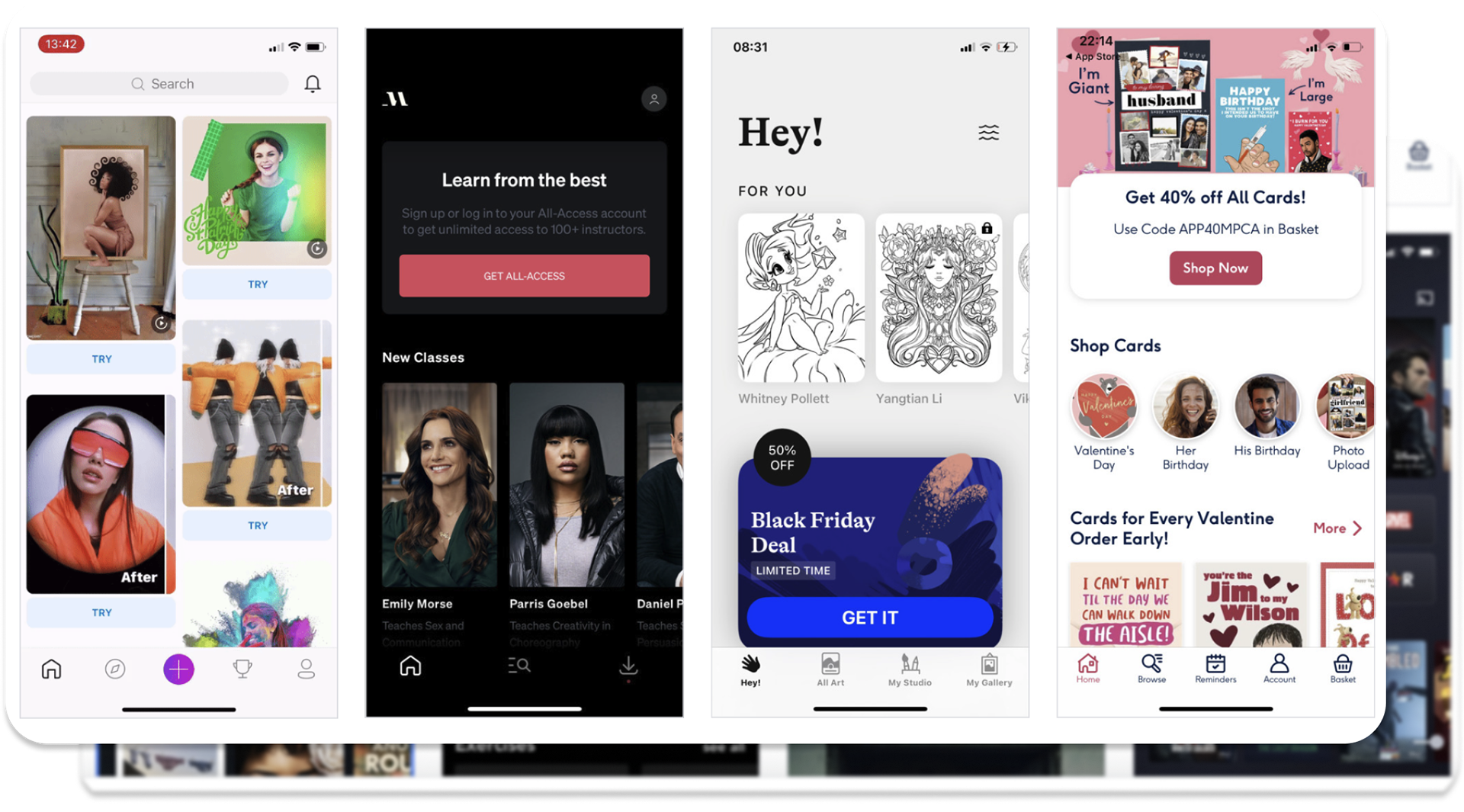
UI INSPIRATION
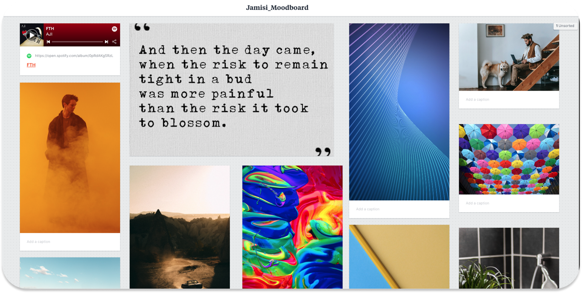
MOOD BOARD
EXPLORATORY SKETCHES
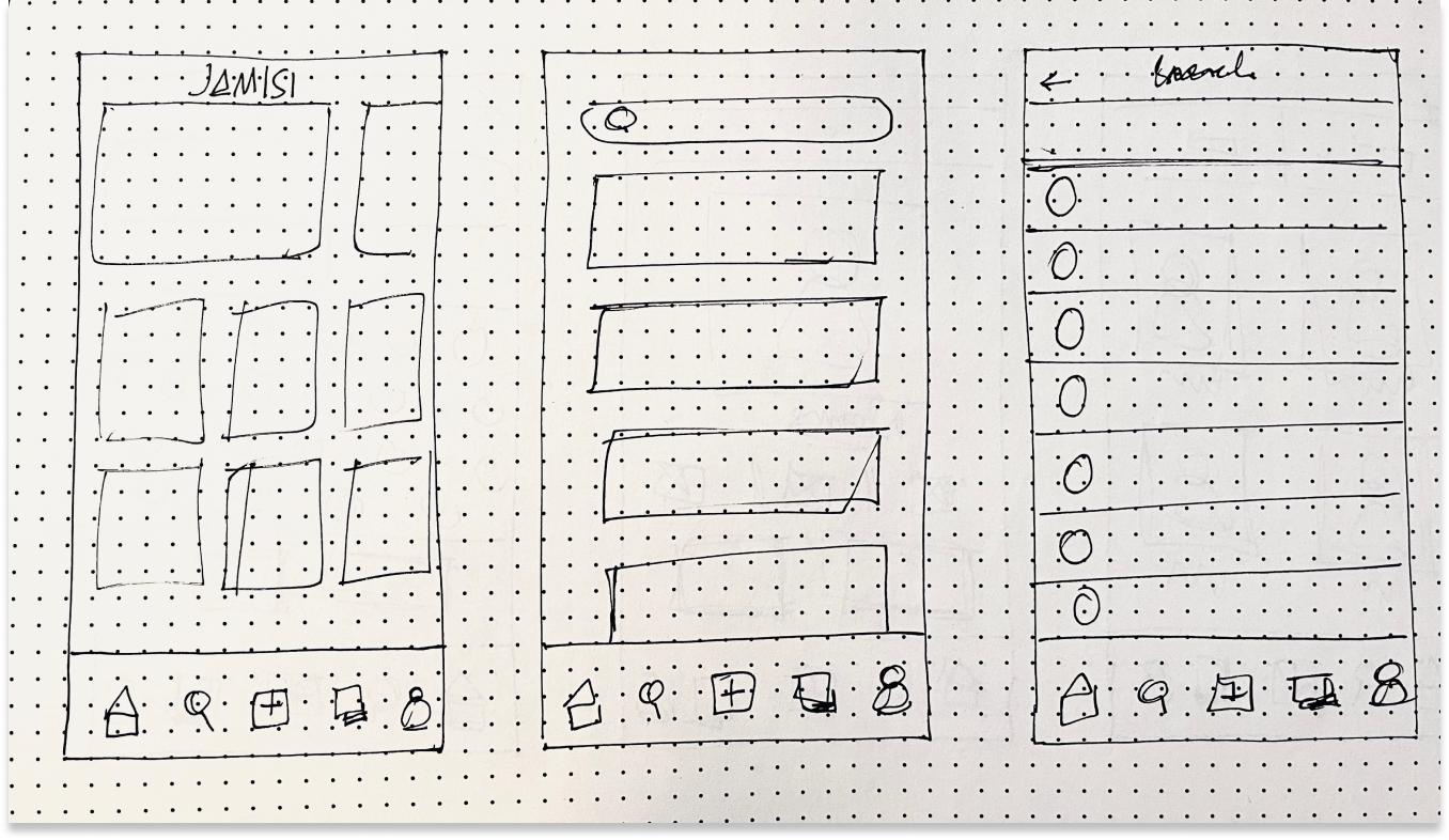
SOLUTION SKETCHES
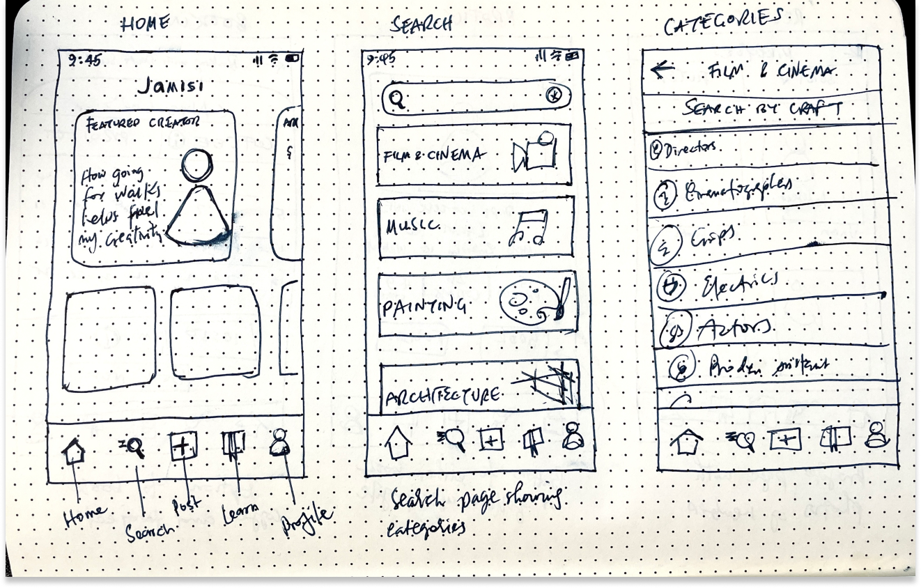
WIREFRAMES
USER TESTING
Tests were conducted to find usability problems in the design as well as to get feedback on missed opportunities and areas of improvement
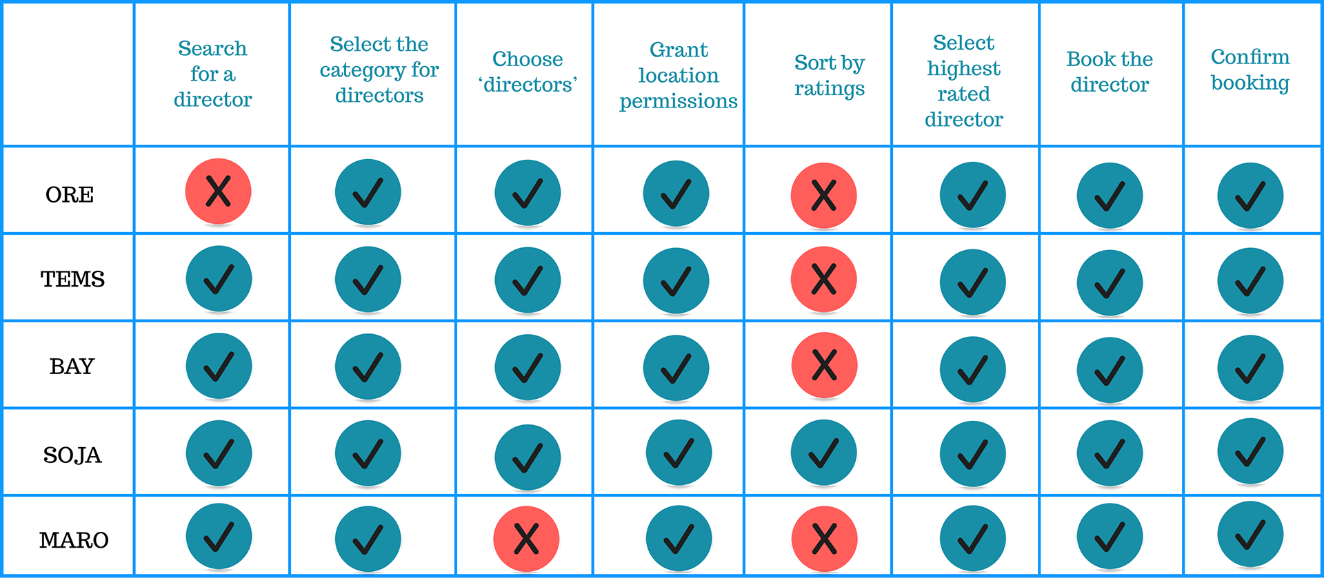
Some users struggled particularly with completing tasks like sorting search results, as well as choosing from a pre-populated search results page.
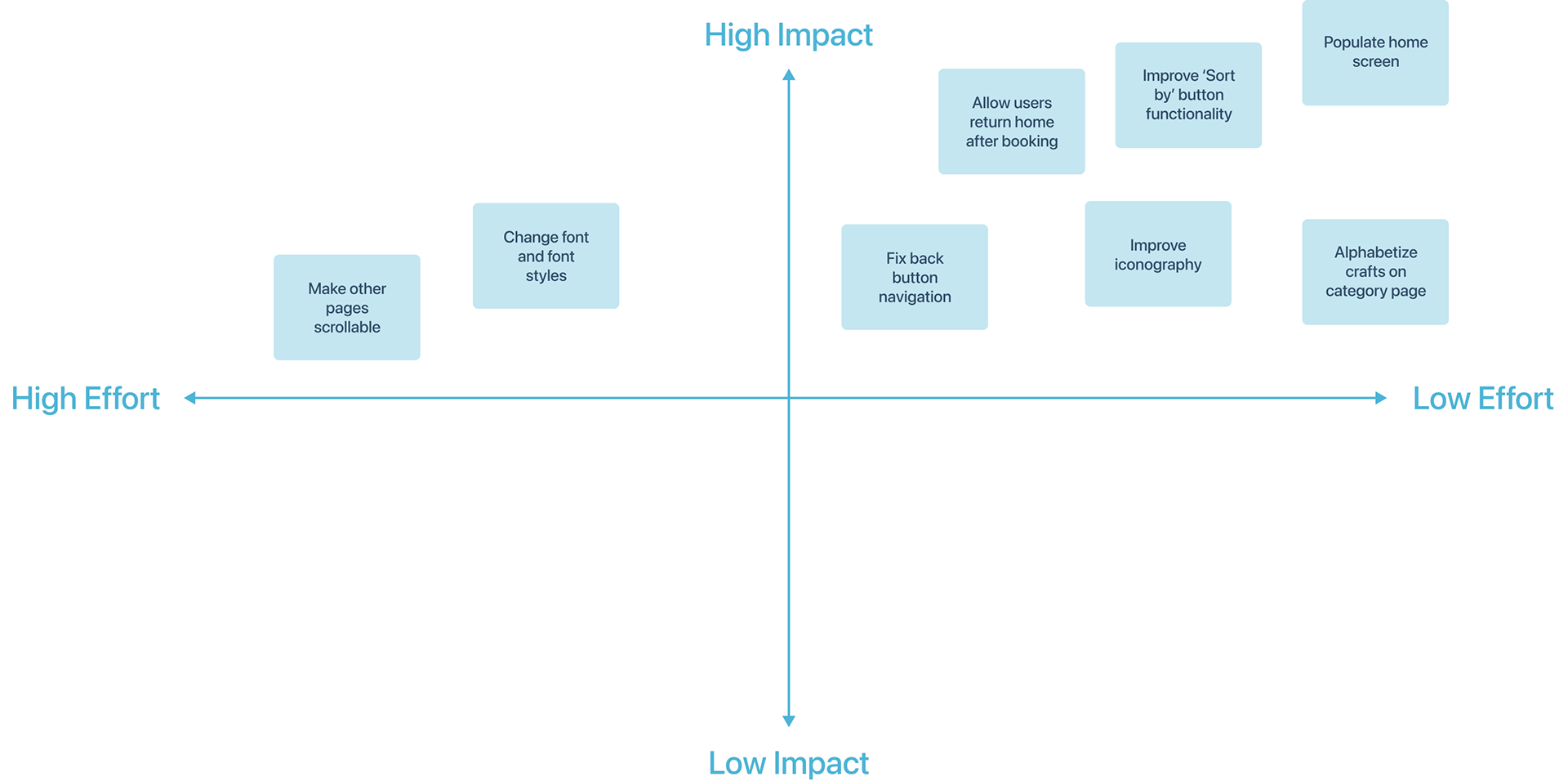
PRIORITIZATION MATRIX
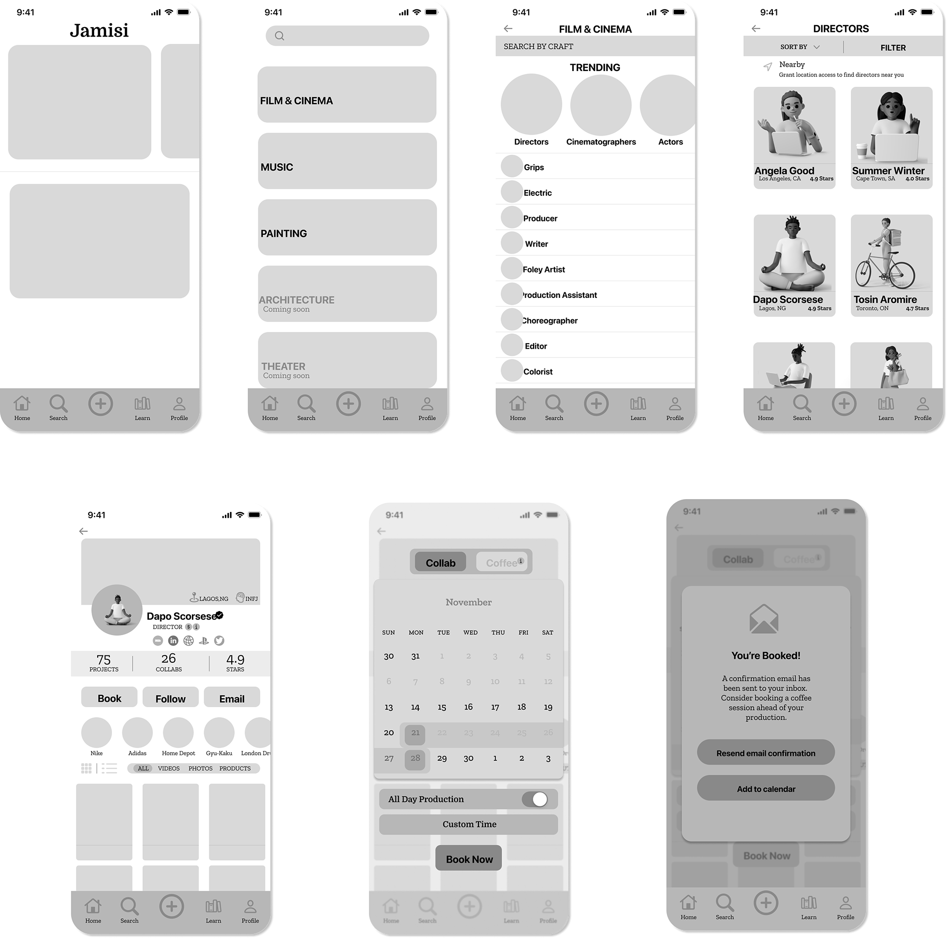
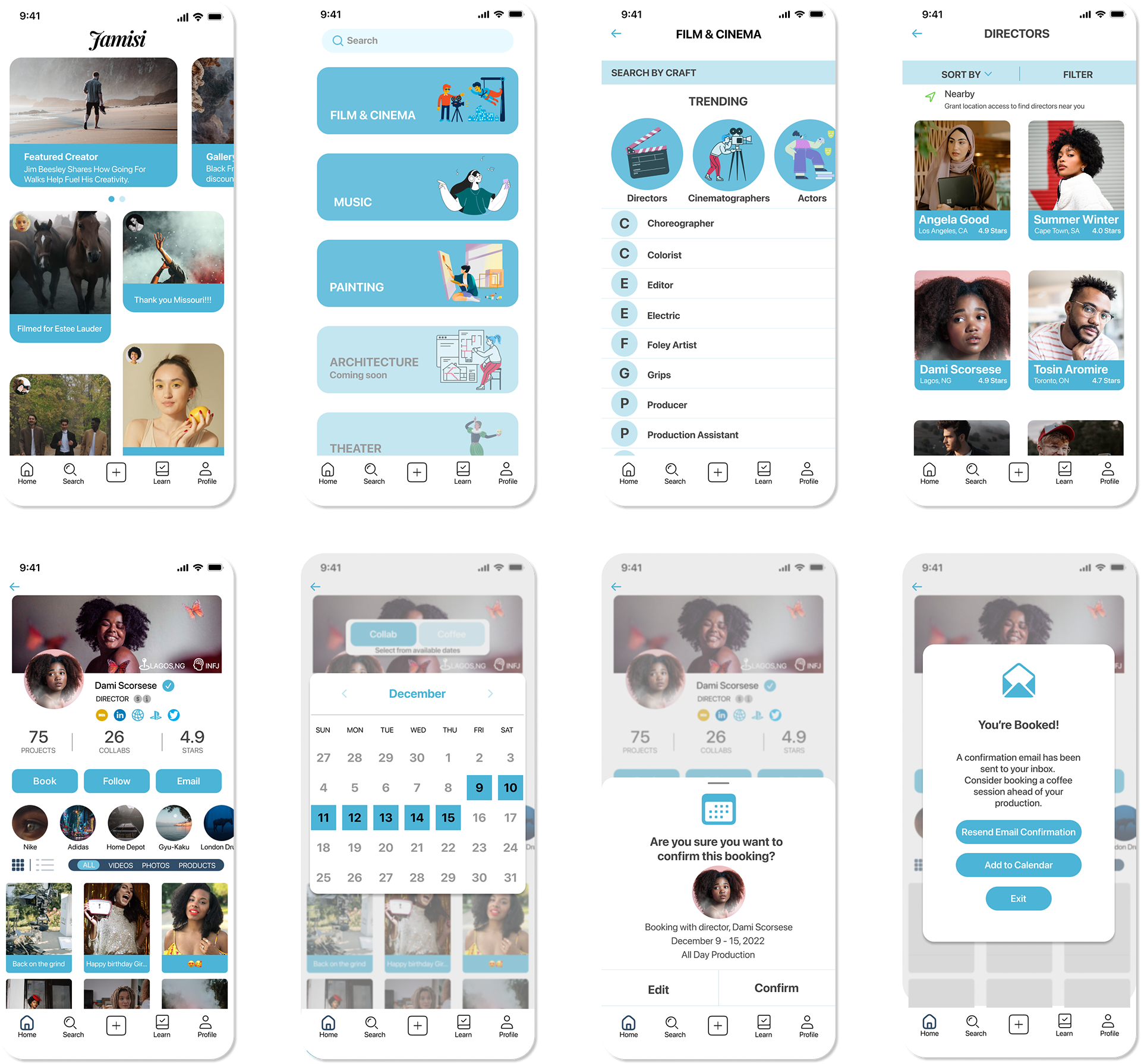
HI-FI MOCKUPS
BRAND IDENTITY
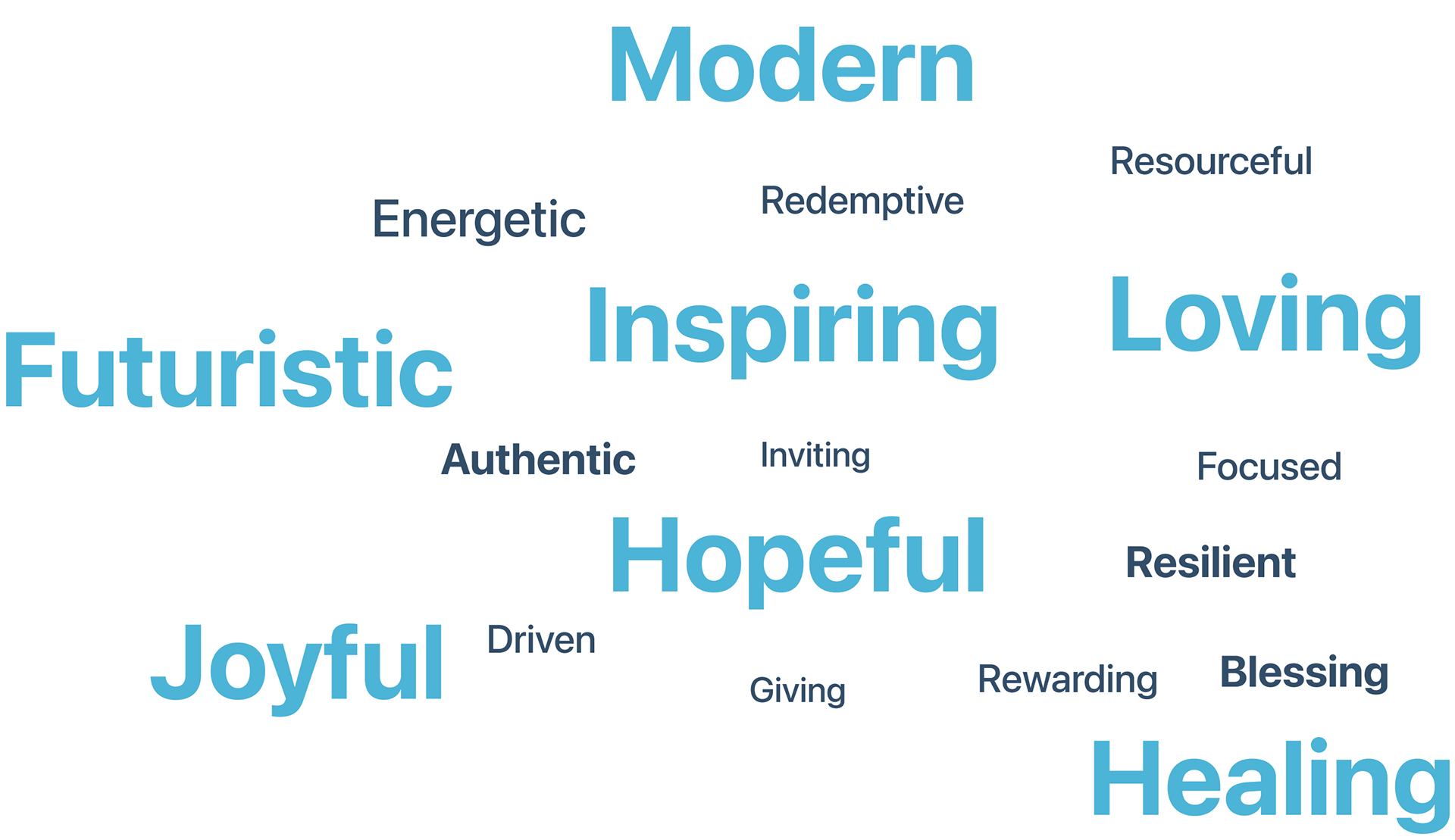
After coming up with about eighteen adjectives, I was able to then narrow down my preferred seven:
Modern, Futuristic, Inspiring, Loving, Hopeful, Joyful, Healing
Modern, Futuristic, Inspiring, Loving, Hopeful, Joyful, Healing
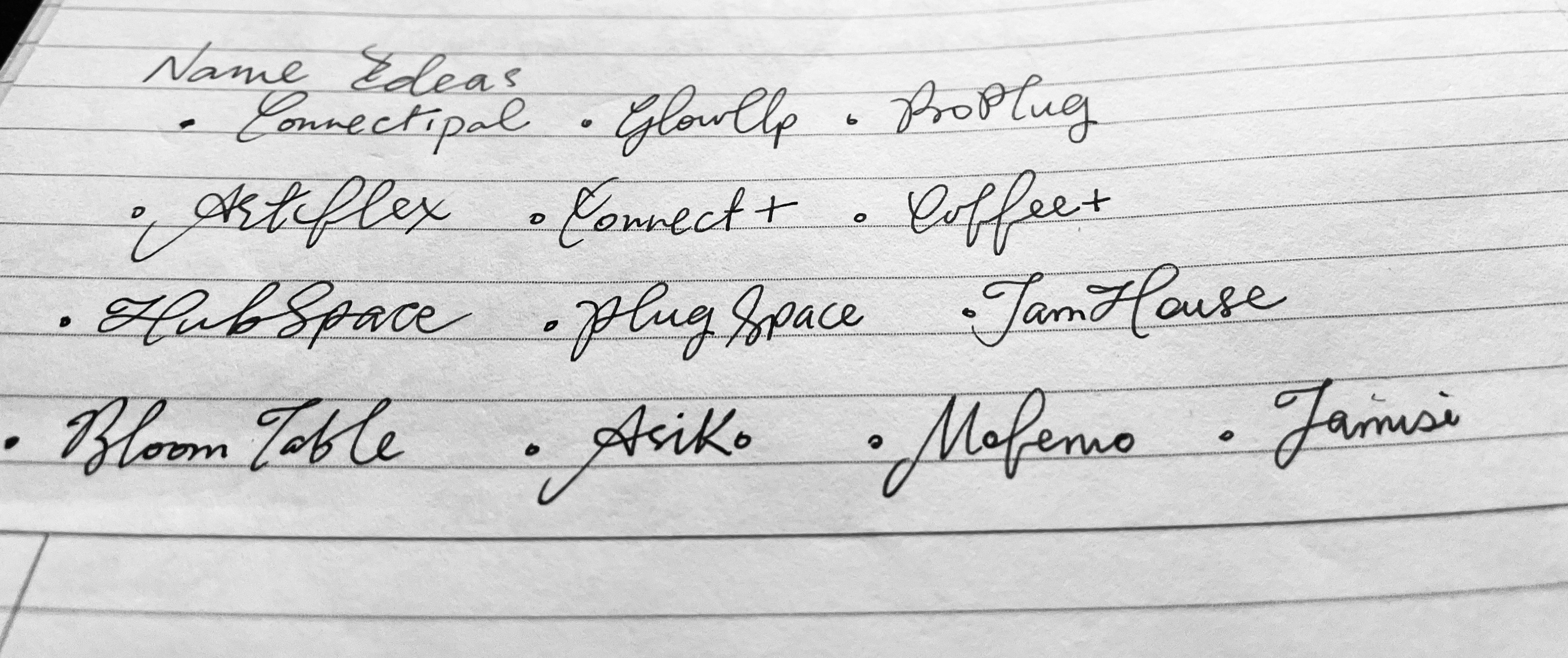
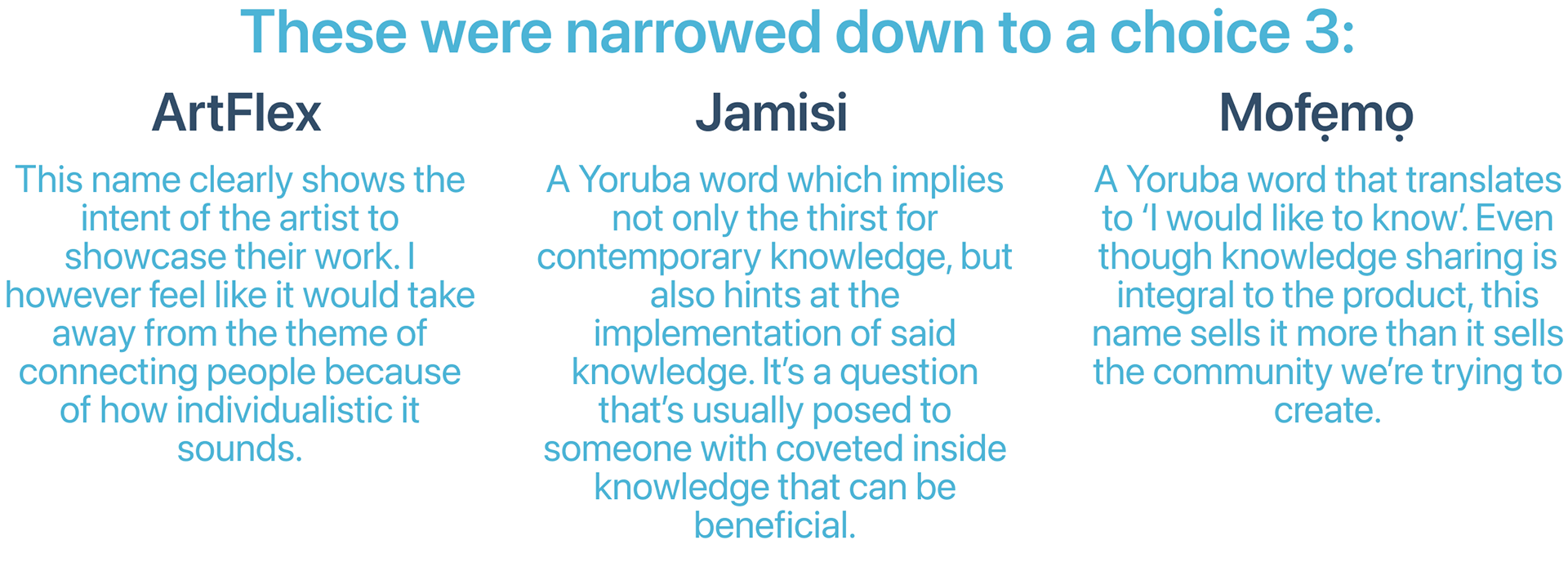
BRAND NAME
these were the names considered:
Connectipal, GlowUp, ProPlug, ArtFlex, Connect+, Coffee+, HubSpace, PlugSpace, JamHouse, BloomTable, Asiko, Mofẹmọ
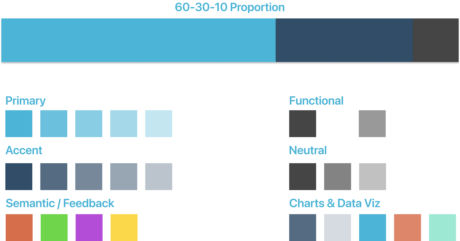
brand colors
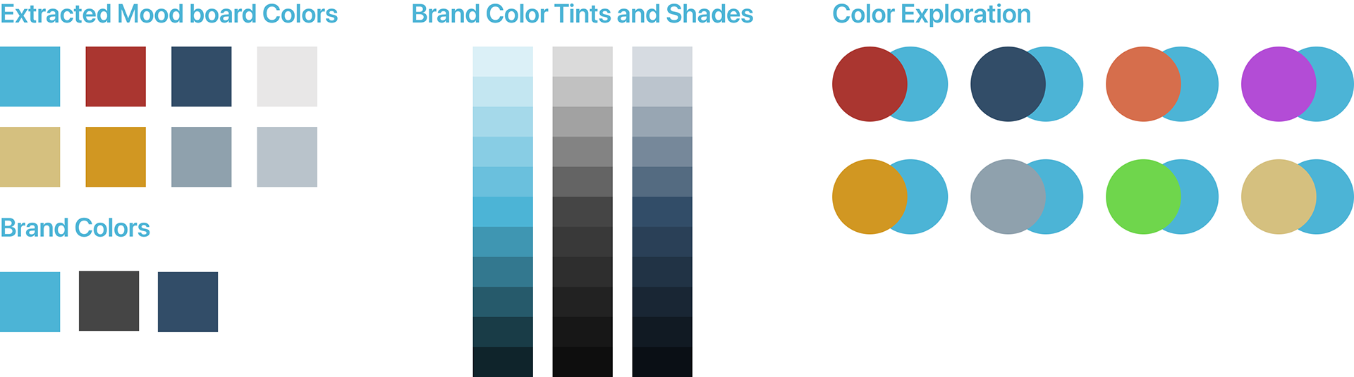
ui colors
prototype
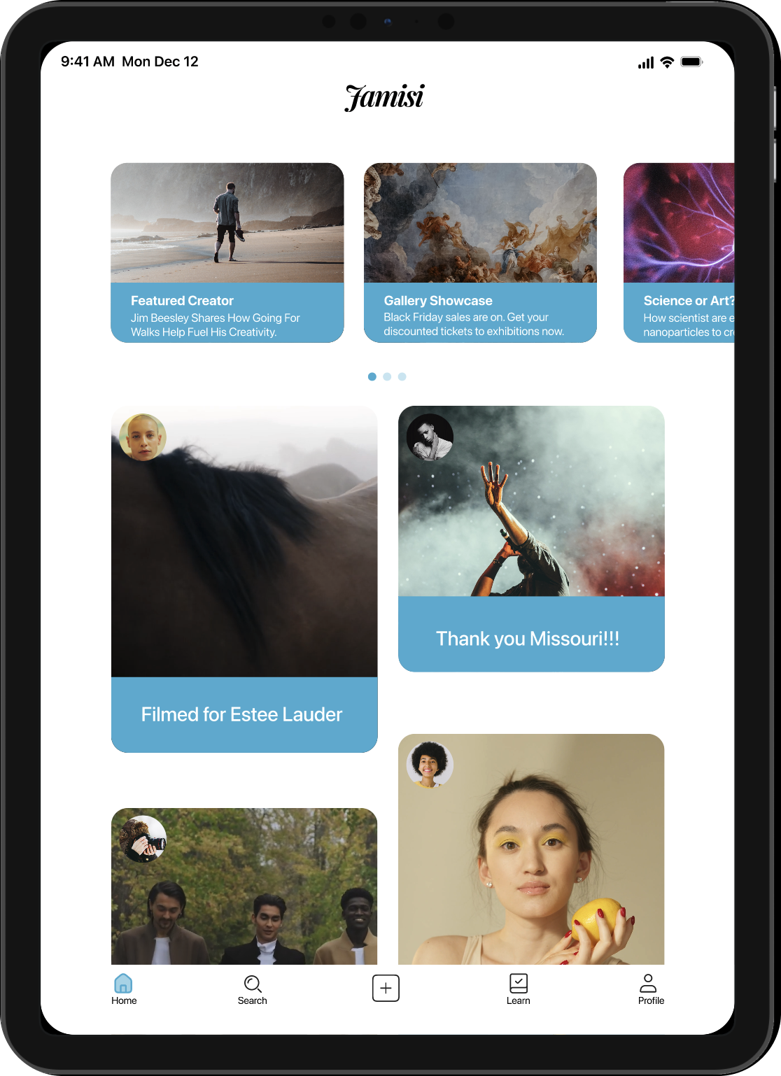
alternate platform
The iPad was an easy choice in opting for an alternate platform to design for. Not only is it a tool used for work by a lot of creatives, the size of the gorgeous display improves the experience of just scrolling through and admiring the work of others.
key learnings
⚬Good design takes time
⚬Feedback is a gift
⚬Always go back to your 'How might we' question for guidance
⚬Feedback is a gift
⚬Always go back to your 'How might we' question for guidance
next steps
⚬Reiterate the design and conduct more rounds of user testing
⚬Consider designing a dark mode design for the night owls
⚬Try to include a feature that allows the user upload inspiration like mood boards and share with their would-be collaborators
⚬Include more emphasis on the importance of having coffee first, before booking.
⚬Consider designing a dark mode design for the night owls
⚬Try to include a feature that allows the user upload inspiration like mood boards and share with their would-be collaborators
⚬Include more emphasis on the importance of having coffee first, before booking.